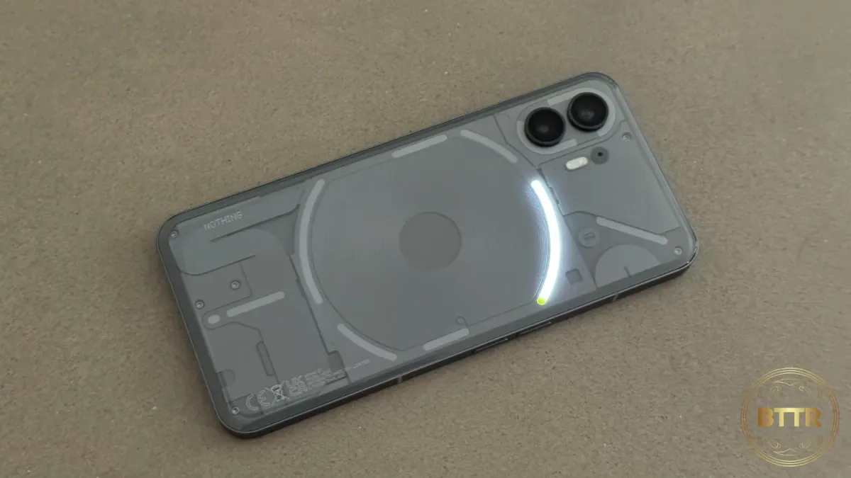
Nothing Phone (2) review: A stiff glyph
The Nothing Phone (2) offers a unique design, but you'll either love it or hate it, and that undermines an otherwise solid phone.

BTTR is independent, but we may earn money when you purchase through links on our site.
Pros
- Unique design
- Great battery life
- Decent camera
Cons
- Super-slippery back
- Glyphs are a bit of a gimmick
- Worst camera shutter sound ever
Well, this is definitely something. Despite being around in the US and Europe since 2020, the Nothing brand of smart devices has come to Australia this year with the Nothing Phone (2) and the Phone (2a).
I’ve been playing around with both models for a few weeks, and for a new-ish brand, I have to say I’m thoroughly impressed by the quality of the hardware and software on offer. While other newer smartphone brands tend to lack polish, this lacks for very little.
The question I had going into this review is this: Why would somebody choose this phone over something like the Galaxy S24 or even a Pixel 8?
The answer, it seems, will come down to personal preference. Nothing’s uniqueness is something, but it’s not for everybody.


