BTTR is independent. We may earn a commission if you buy through our links. Why trust us?
Pros
- Strong Performance
- Fantastic battery life
- Great camera quality
Cons
- Gimmicky Glyphs
- Design not for everyone
- Nothing UI
When it comes down to it, the Nothing Phone (2a) is a stripped down version of the Nothing Phone (2).
It offers a similar gimmicky “Glyph” light up notification system, though with fewer lights, a slightly slower processor, and a slightly cut back camera array.
And yet, those sacrifices seem to make the Nothing Phone (2a) stronger when compared to the price tag.
I’ve long argued that cheap and mid-range phones are striving to find the right balance between price and performance. I’d argue that the (2a) finds that balance perfectly, though like its bigger brother, you’ll either love or hate the design.
What does the Nothing Phone (2a) offer?
Nothing has created an extremely well-balanced mid-range Android smartphone.
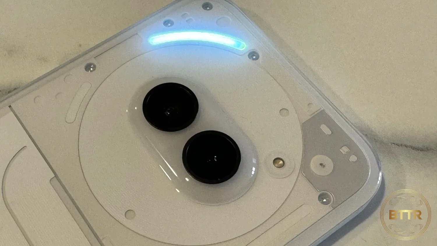
But the biggest reason anyone is going to consider buying (or not buying, for that matter), is the Glyph system on the back of the phone.
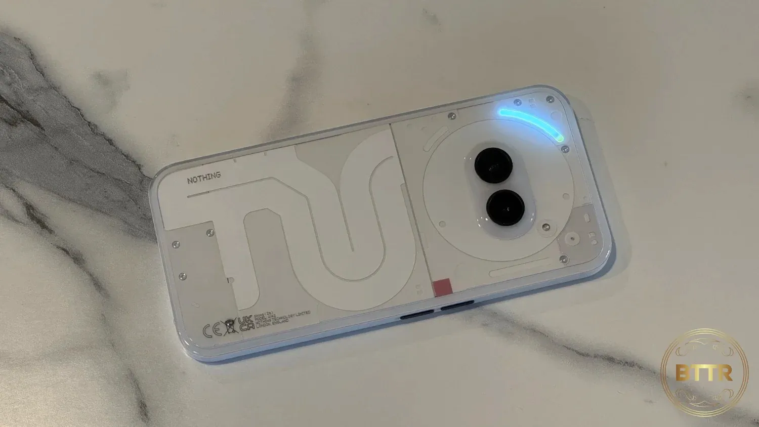
The back of the phone is transparent plastic, and shows off a bunch of LED light strips around the dual camera array. That’s significantly fewer lights than the Nothing Phone (2), but this is a significantly cheaper phone.
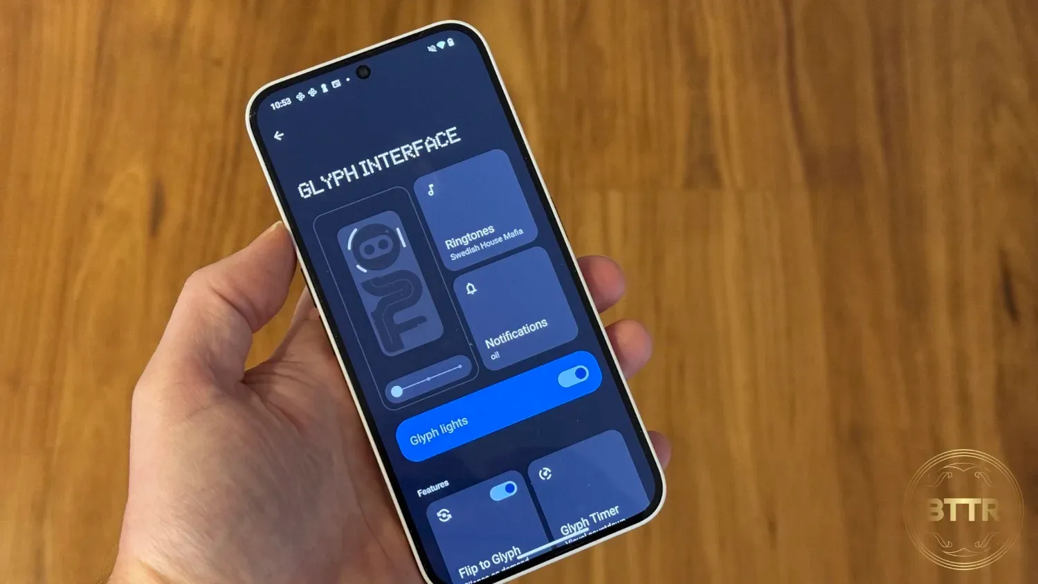
The glyph system is designed to show off different notifications or alerts. It can light up as you turn up the phone’s volume, show a countdown timer or integrate with third-party apps like Uber, which shows how far away your ride is.
It can show off different light patterns when different people call you, so you can identify them by the flashes. So long as your phone is upside-down, and you remember the right combo.
Honestly, I think it all sits firmly in the “gimmick” camp. Why try to remember flashing light sequences when the other side of the phone shows you a picture of the person calling?
But if you can get past the Glyph thing, then the (2a) is a remarkably solid phone.
What does the Nothing Phone (2a) do well?
The opposite of Nothing. Pretty much everything the 2a does, it does extremely well.
Benchmarked against other phones in the $300-$600 price range, it wipes the floor with them. Here are GeekBench 6 scores for the Nothing Phone (2a) against the Moto Edge 50 Fusion, TCL NXTPAPER 40, OPPO A79 5G and Moto G84 5G:
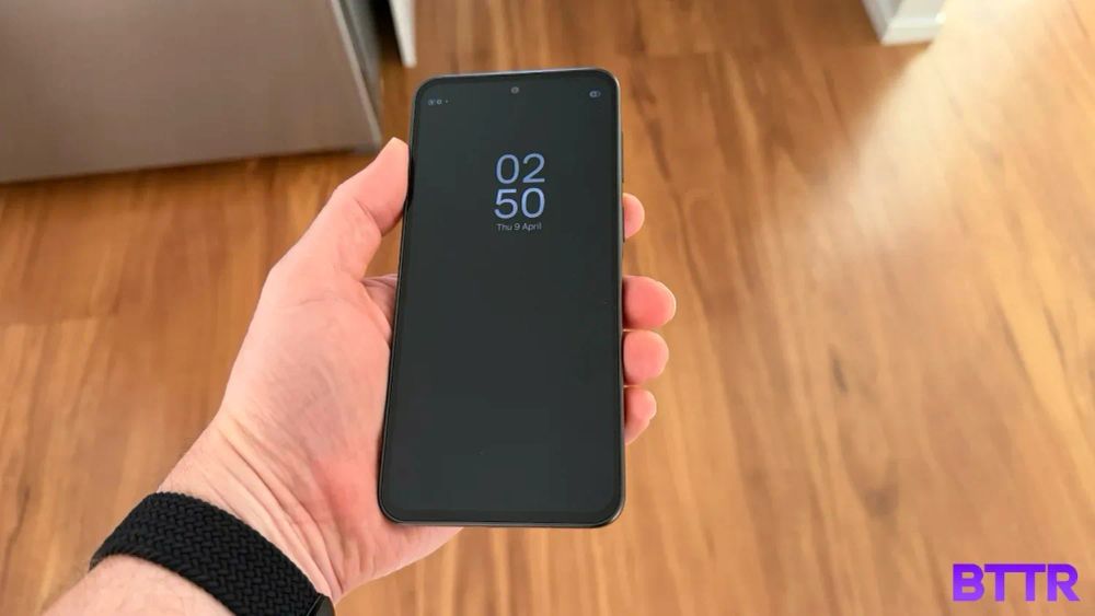
The 6.7-inch AMOLED display supports a 120Hz refresh rate with a 1084 × 2412 resolution. Everything looks fantastic on the screen, whether you’re playing Mighty Doom or Diablo Immortal, streaming the latest episode of The Acolyte on Disney Plus, or just browsing the latest review on BTTR.
That refresh rate helps things scroll super smoothly, and the MediaTek Dimensity 7200 Pro seems to do a pretty solid job on everything you throw at it.
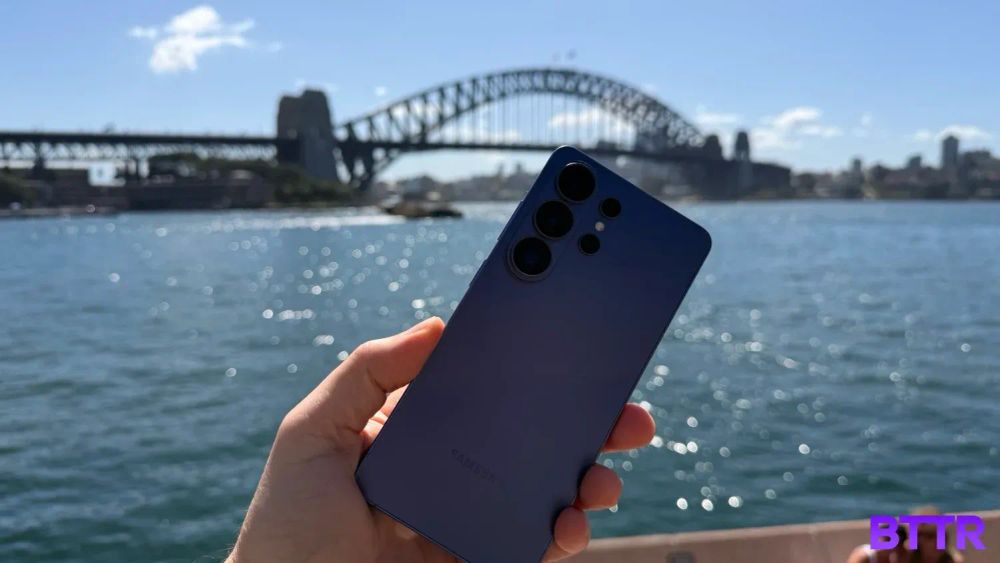
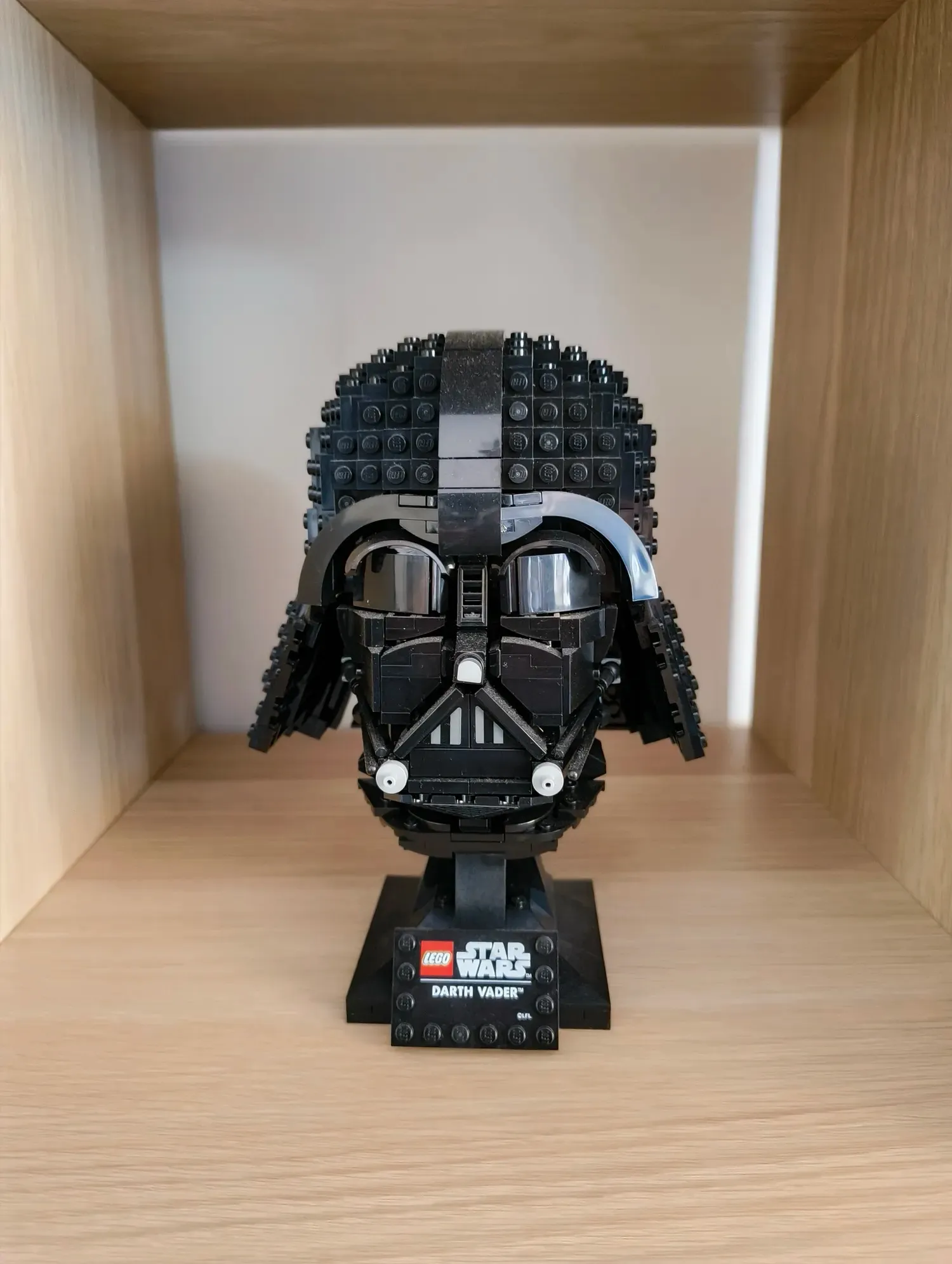
The camera does a solid job as well. I was expecting to be a bit disappointed here, but as you can see, the photos it takes are well exposed, and the colour is well-balanced too.



The only real down-side with the camera array is that it doesn’t offer a Telephoto lens, instead opting for a wide and ultra-wide array.
That’s not going to make too much of a difference to most people, particularly those shopping at this price point.
The other strength of the (2a) is its battery life. The Dimensity 7200 Processor must be extremely modest with its power consumption because the phone battery lasts.
You’ll easily get through a day, sometimes close to two, depending on how you use it.
What could the Nothing Phone (2a) improve?
Look, I’ve already lamented the exterior design of the Nothing Phone (2a), so I won’t repeat myself here.
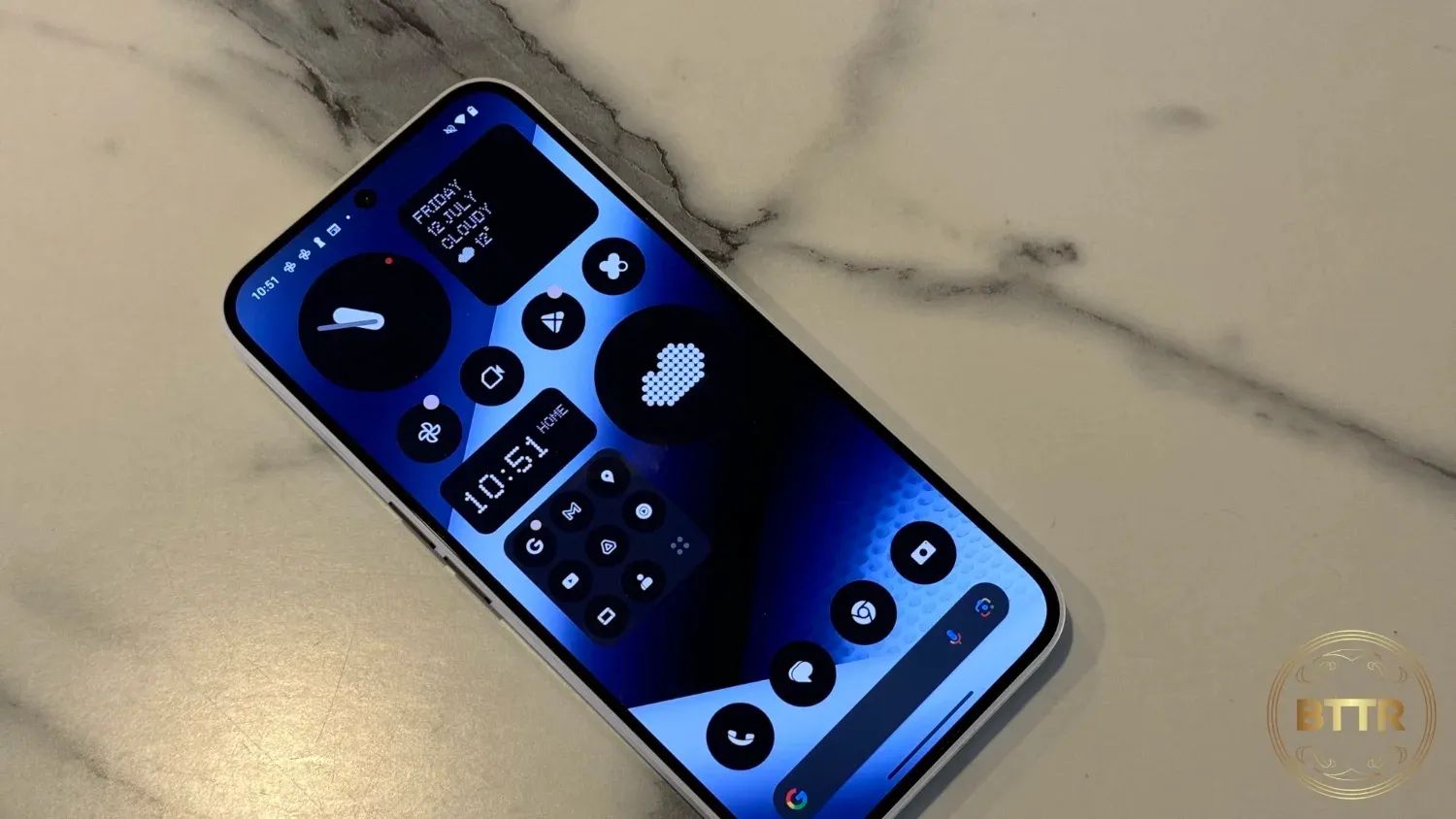
But I also want to call attention to the Nothing UI. The more I used Nothing’s understated, lo-fi user interface, the more I hated it.
From the colourless icons to the dot-matrix widgets, I found the style interesting at first, but grating after a few weeks. I couldn’t wait to change it to Android’s default system.
Verdict
There’s a fair amount of competition in the $300-$600 price range for smartphones, but the Nothing Phone (2a) has carved out a comfortable seat at the table.
Against phones like the NXTPAPER 40, it dominates on the performance front, like me trying to arm-wrestle my 12-year-old daughter.
Whether you would consider this phone or not will come down to whether you are open to its unique style or not.
But if you are, then know that you’ll get a smartphone that will exceed your expectations on performance.

